Tuesday, June 30, 2015

I've got the magic in me


             Light painting is a photographic technique in which exposures are made by moving a hand-held light source while taking a long exposure photograph.

            The model of this picture is no other than my jolly friend Lenore Quibael. I named her I've got the magic in me because as you can see in the picture,she has a magic that can make you disappear or turn you into something.Joke =) It such as an adorable shot because I capture how I really want it to be.

          During this shoot I'm accompanied with my friends(Lenore Quibael , Adonna Velez, Dinniez Manalo and Noreen Asuncion). It was a great experience doing this kind of activity from scratch or nothing ideas, we collaborate to have an output that is amazing and unique.


Saturday, January 17, 2015

Brushes! =)

During this meeting we learned  about brushes,Little did i know that we can make our own brush presets using text, images and new brushes and we learned to clip mask the picture using some brushes. 

Here some of the pictures that illustrate how to use the brushes and examples.


how to create a brush


example brushes using text and images


presets brushes using different colors

This taylor swift picture is the one i edited on the Maclab.


After we finish learning about the tools of photoshop, we learned how to enhanced the text. I didn’t expect that in photoshop we can do those things. Using the pen tool we can more enhanced the text like the spaces between the letters that what we called leading and we can wrap the text. Using the custom shape tool we learned that we can put texts on the shapes. And we also learned the differect kinds of logo, What should we have done to create a good logo and things to remember to create a better logo. There are four kinds of logo: Textbased,Emblem/Iconic, Illustrative and the combination of the 3 kinds of logo. And i learned that the logo should be simple, contains one to two colors only and the logo can be converted to black and white color.
My example of  simple typhography using photoshop.


I edit the sentence using the text tool.


I edit the text using the shape tool and pen tool.
 
I wrapped the texts.

My example of the three logos.

Friday, January 9, 2015

Magic Tools :D


Parts of the photoshop tools


Adobe Photoshop

In just one click it turns to magic. Sounds cool right? Yeah that happen on adobe photoshop, even your photo is old it can be restored with the help of different tools in photoshop, it can beautify a picture and on the other way around it can be ugly. Photoshop features a lot tools to edit photos. There are tools that can clone the picture, select a portion, crop a photo, add texts, add brushes, add background color and etc.I really learned a lot because even though i'm a bit familiar with Photoshop, it really helps that you teach us the basic and some techniques that will hep us to work easily.


I edit a rubber ducky and it really looks ugly.hahaha =)

Friday, November 28, 2014

File Formats


During this meeting we learned about  file formats,resoultions, kinds of images and some tips that we can used to improved our works.  Little did I know there are lots of file formats because I only knew the basics like in images: jpeg,hdr,gif  and bitmap. In sounds: mp3,wav and wma while in movies and documents are wmv,mp4, flv,pdf,html and doc.We learned that when printing works from photoshop the resolution should be 300 ppi to have a good quality and all the colors are present.Because if we don’t change the resolution the outcome will be pixelated and some colors of the works are missing.  There are 2 kinds of images raster and vector.

Here are some terms that we learned.

Raster is made up of pixels.

vector is made up of lines.

Lossy it refers to data compression techniques in which some amount of data is lost.

Lossless is a class of data compression algorithms that allows the original data to be perfectly reconstructed from the compressed data.


Saturday, November 22, 2014

Color Theory

During the second meeting we learn more about color theory.  Color theory encompasses a multitude of definitions, concepts and design applications. Color theories create a logical structure for color. For example, if we have an assortment of clothes, we can organize them by color and place them on a circle that shows the colors in relation to each other.

Color wheel


There are categories  of colors based on the color wheel. We begin with a 3-part color wheel.


Primary Colors: Red, yellow and blue
These are the 3 pigment colors that can not be mixed or formed by any combination of other colors. All other colors are derived from these 3 hues.

Secondary Colors: Green, orange and purple
These are the colors formed by mixing the primary colors.

Tertiary Colors: Yellow-orange, red-orange, red-purple, blue-purple, blue-green & yellow-green
These are the colors formed by mixing a primary and a secondary color. That's why the hue is a two word name, such as blue-green, red-violet, and yellow-orange.

Here are some terms to remember.

Harmony can be defined as a pleasing arrangement of parts, whether it be music, poetry, color, or even an ice cream sundae.

In visual experiences, harmony is something that is pleasing to the eye. It engages the viewer and it creates an inner sense of order, a balance in the visual experience.  Color harmony delivers visual interest and a sense of order. Extreme unity leads to under-stimulation, extreme complexity leads to over-stimulation. Harmony is a dynamic equilibrium.

  Analogous colors


 These colors are any three colors which are side by side on a 12 part color wheel, such as yellow-green, yellow, and yellow-orange. Usually one of the three colors predominates.
 Complementary colors


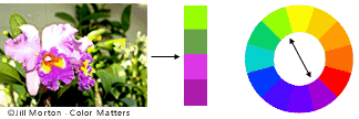
These colors are any two colors which are directly opposite each other, such as red and green and red-purple and yellow-green. In the illustration above, there are several variations of yellow-green in the leaves and several variations of red-purple in the orchid. These opposing colors create maximum contrast and maximum stability.


Monochromatic colors are all the colors (tints, tones, and shades) of a single hue.


Example of a monochromatic color scheme
Monochromatic color schemes are derived from a single base hue and extended using its shades, tones and tints. Tints are achieved by adding white and shades and tones are achieved by adding a darker color, gray or black.

Tint is the mixture of a color with white, which increases lightness. 

Shade is the mixture of a color with black, which reduces lightness. tone is produced either by the mixture of a color with gray, or by both tinting and shading.

Tone is produced either by the mixture of a color with gray, or by both tinting and shading.


Hue refers to a pure color—one without tint or shade (added white or black pigment, respectively).


Saturday, November 15, 2014

1st meeting :D

    1st meeting was really fun and exciting.I'm excited because we gonna use Mac computers. :) I've already use before Mac laptop but that was from my cousin and I only knew only little things on how to use it. For me I  really dream to have a Mac computer or laptop because I think it is fun and has an amazing interface to use. Having a computer to use like that I think it really attract the students to study and learn. It was exciting because we gonna study about colors. On the first meeting I learn a lot.I learn that planning is really important when doing things. I learn to create a creative brief .And I learn that we should ask what the customer wants and follow what the customer or clients on his/her brochure/picture/vieo and etc.